If we've heard it once, we've heard it a thousand times: Don't judge a book by its cover. But honestly, that really only works with people. And maybe books. When it comes to judging the quality of a company and its products, one of the first things people will do is assess how the website looks to decide if they want to stick around. That's right. Your website design can make or break a buying decision.
Studies have been published explaining that the design of a website is the primary factor in determining if they stay or if they move on.
And, believe it or not, we make a snap judgements on these things within a second or so. That means your website design had better communicate quickly and easily. That's not to say your entire value proposition needs to be explained that fast. Before they get to that they have to feel something that makes them want to stay. That's why you'll need to express, in less than few seconds, your company's:
- Professionalism
- Trustworthiness
- Understanding of the visitor's needs
So how can you do that?
Here Are 4 Tips for a Website that Creates Leads
- Be sure your website reflects your brand personality.
- Have a clean and easy-to-understand website.
- Add video to your website design.
- Use a Call-to-Action.
If you're not meeting all of these things it may be time for a design update.
1. Be sure your website reflects your brand personality
We have a client who sells beautiful wedding dresses. Recently, they updated the interior of their store. For them it was critical that their website match their in-store experience so that brides would feel the experience before, during and after their visit.
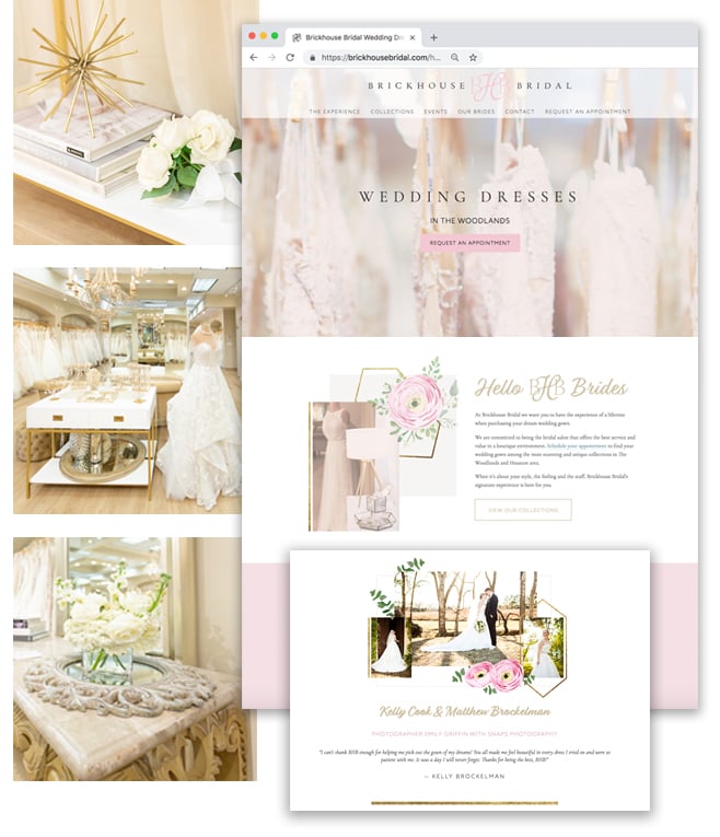
Really show off your brand and your personality on your own website. Use your unique style to help people to understand the type of company you are and what it would be like working with you. Expressing this can be done in your website design using:
- Colors
- Fonts
- Imagery
- Text/Phrases
2. Have a Clean and Easy-to-Understand Website
Clean Design
It can be so ambiguous when someone tells us they want a “clean” website. There are quite a few definitions out there. But here’s what we mean when we say clean web design: Make it easy for visitors to know what to look at first and what you want them to do next.
One great way to do this is with white space. Leaving room around what you want everyone to focus upon will help direct their attention with less distraction.
For more information, you should read our blog about using white space in your website design.
Easy-to-Understand Website Content
Making your products and services easy-to-understand is harder than it sounds. Sometimes we get bogged down into the technical terms, or we use acronyms that someone who is early in the buying process may not know. When writing, use the simpler words and shorter sentences. Even if you're writing to the smartest people in the world, they still like to look at a website and quickly understand what you're saying.
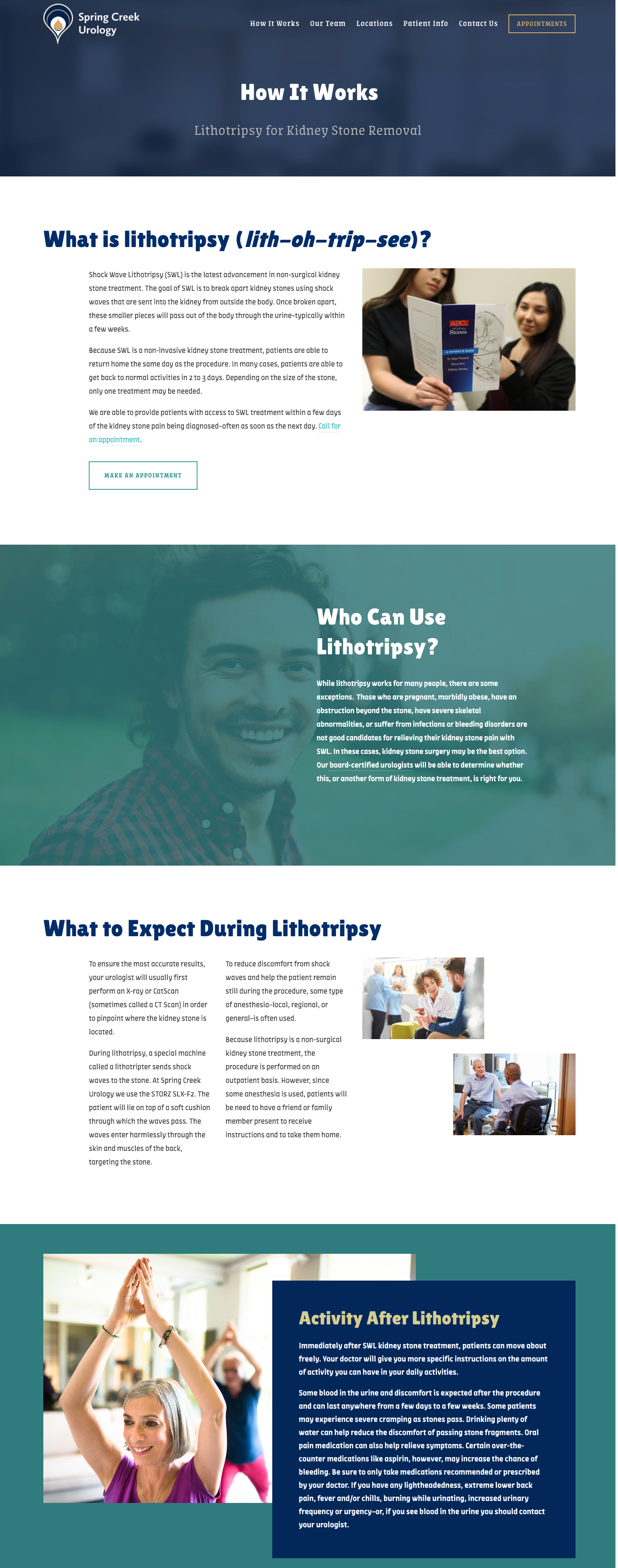
In this example for kidneystonetreatmentnow.com, we created a website unlike most in its category. It's easy to read while using space (that's not technically "white") to help people scroll through and understand this treatment option. It's a medical procedure, so there are things to explain here, but it doesn't have to be overwhelming. Breaking it apart with some space and easy-to-follow words helps the reader know if this might be something they'd like to try.
3. ADD VIDEO TO THE WEBSITE Design
You probably already know that rotating web banners aren't the way to go anymore. Data has continued to showed that literally no one is clicking on them, especially after the first one in the rotation, so you don't see them so much any more. And, let's be honest. Those banners were mostly talking about you and why you're awesome. But in reality, we know that visitors are coming to your website to hopefully answer a question or solve a problem they have.
This is where video could be very useful. Video content is watched more and retained better than text content. Create some short (less than 2 minutes) videos about how you can solve your primary target market's problems and incorporate this content into the design. It shouldn't seem like an afterthought.
Read: 3 Ways to Create Videos That Look Great and Cost Almost Nothing
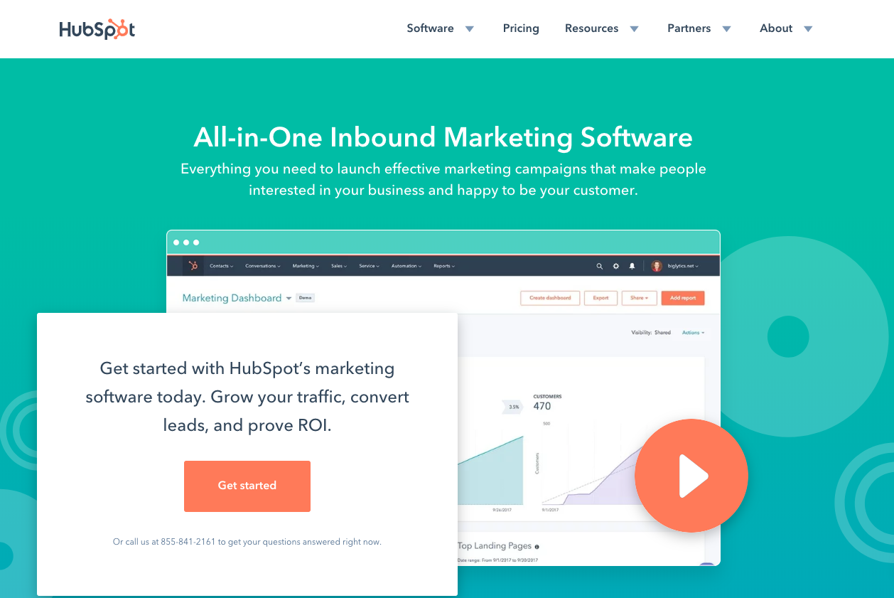
One way to handle video on the home page without an awkward "still image" or without auto-starting a video is using a button. Include some brief text at the top of the page in billboard format – very short and sweet. Then add a "Watch Video" button or a "play" button.
NOTE: Try to use something other than YouTube for this so that your branded colors are carried through to your video and you can track views of the video.
Here is an example of just one way we've seen video worked into the content.
4. use callS-to-action
Ultimately your website has to do more than look good. It has to produce leads that turn into sales. The website design is a huge and critical part of that. Providing a pleasing experience that will help a visitor move along in their buying journey is the designer's job. So what do you do to get them to the goal of converting to a lead and ultimately a customer?
We know that everyone has slightly different needs, but if you've carefully evaluated who you are targeting (your personas), the messaging and imagery is likely to appeal to them and make them feel comfortable enough to take the next step. So don't leave out one of the most critical things that we see missing all the time. Include a call-to-action. Tell them what they can do next:
- Get a free report
- Download a helpful checklist or booklet
- Free trial
- Make an appointment
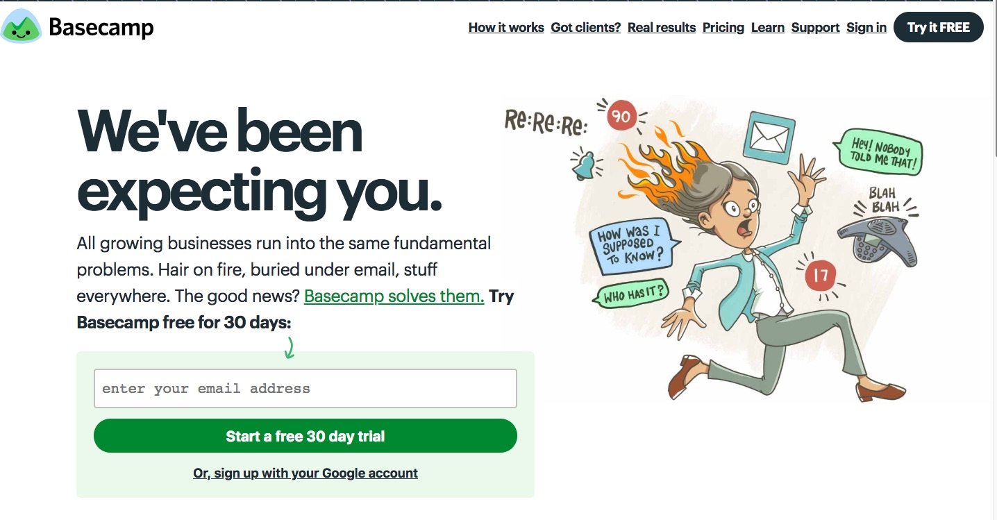
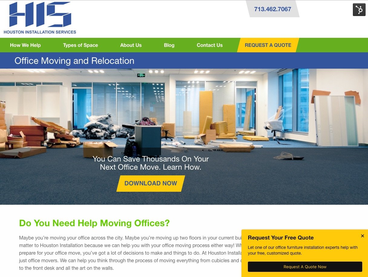
But do this with good web design. You can use colors, images, pop-ups, videos, forms, and other creative ways to get someone to take an action on the website. Here are few good examples of design and color to draw your eye.
If you're using HubSpot, you can even create Smart CTA's that will allow the message to vary based on who they are. For example, existing customers may see something different than visitors you don't know. Read more about creating CTAs in our blog: 6 Tips for Calls-to-Action that Increase Leads.
THE ULTIMATE GOAL OF WEB DESIGN
The ultimate goal of web design is to help the visitor through the buyer's journey.
Website design will admittedly only get you so far. You have to have great people to back up your well-designed website. But honestly, it’s where the entire experience starts which makes it critical. Don't lose customers because you have an outdated site or one that is confusing.
Give them the warm-fuzzies by showing them you what they’re doing, can be trusted and you're an expert on the problem they're trying to solve.
Keep adding content to the website that will help guide your potential customer. And also add content for your existing customers. Help them out too. Make them your biggest fans and referral source.
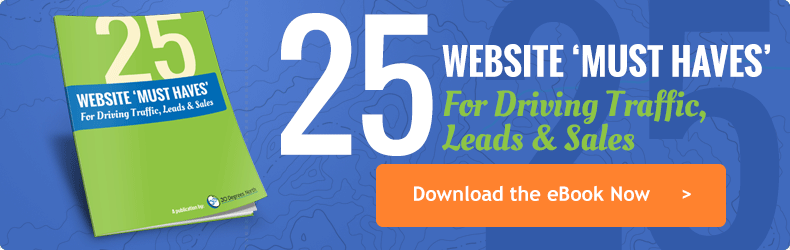
We recommend downloading our free e-book, 25 Website Must-Haves, and tell us in the comments what you think is most important when designing a website. In our e-book, you’ll learn more about website design as well as other aspects of your website that can be used to increase the number of leads you can collect through your website.