
Pop-ups can, and do, work when done right. But what's that happy medium? Do they turn visitors off or do people really click on them? If you're using pop ups now, do they meet Google's requirements?
Here are eight do's and don'ts for website pop-ups that you should stick to for more lead generation in 2024:
8 Rules for Using Pop-ups in 2024
- Don't: Overwhelm Your Visitors
- Don't: Guilt Your Visitors
- Don't: Use Mobile Pop-ups That Take Over Their Screen
- Do: Time the Pop-Ups so They're Helpful, Not Annoying
- Do: Keep it Simple
- Do: Consider Exit Intent Pop-ups
- Do: Choose Your Pop-up Placement Carefully
- Do: Change Your Pop-ups Based on Results

3 Don'ts for Website Pop-ups
1. Don't Overwhelm Your Visitors
Do your visitors have trouble getting into the content on the website before being bombarded with things that are fully or partially taking over the screen? Remember, everything is mobile-first. Have a look at what happens when you load your website on your phone. It's like that there's a lot happening in a small space, especially when you first arrive.
Things that load when you first get to a website include one or more of the following:
- A cookie consent banner
- A chatbot or live chat offer
- Accessibility icon
That's a lot to deal with. Add a pop-up marketing message too soon and it will either be ignored or drive the visitor away. (See our blog about how web design impacts whether people will stay on your site.)
Consider these questions as you create pop-ups that your visitors will experience on your website:
- Do marketing message pop-ups need to appear within the first few moments of arriving on the site? Have a look at how long people are staying on the page where you're adding the popup. It'd be better if you added it somewhere in the middle to the latter part of the average time on the page.
- Is the home page really the best page to target potential customers with your pop-up? Some home pages serve current customers as much, or more than, potential customers by offering a portal login, training links, etc. If that's the case for you, consider skipping the pop-up message on this page and focusing on pages where potential buyers are spending time. This will clean up your home page experience.
- Do you really need to know the visitor's location straight away? Sometimes you really do. And sometimes, you're gathering it for use later or for your own data collection. I know, personally, if I don't see a need for you to have my location right away, I'll decline and wait till it's necessary.
✔️ As part of the trust-development process with your website visitors, only ask for what you need when it's needed.
2. Don't GIVE YOUR VISITORs A GUILT TRIP
Have you ever seen a website pop-up that makes you feel like a bad person for declining? I've seen some really offensive ones like:
Would you like to subscribe to our email to get updates from the veterinarian?
Yes, I love my pets. --or-- No, I don't really care about my pets.
What? Just because I don't want to sign up for whatever they're offering doesn't make me an animal hater. And who wants their visitors to associate these negative feelings with their products or services? Consider choosing text that doesn't give anyone a guilt trip. Here's that same example, but less abrasive:
Would you like to subscribe to our email to receive helpful updates from the veterinarian?
Yes, I love to learn new things about my cute, cuddly pets. --or-- No thanks, my inbox is already full.
Being kind in your pop-up offer could be the difference between a visitor staying or leaving because of how you've made them feel.
3. Don't use mobile Pop-UPS that take over the screen
Google made changes to what they consider acceptable pop-ups back in 2017 as part of the Core Web Vitals Update. (Learn more in our blog: Google Core Web Vitals Update: What You Need to Know.)
That's why you must pay attention to the following if you use pop-ups that appear at the mobile screen size:
- The pop-up cannot cover the main content, either immediately after the user navigates to a page from the search results, or while they are looking through the page.
- Displaying a standalone pop-up that the user has to dismiss before accessing the main content.
- Using a layout where the "above-the-fold" portion of the page (what you see before you have to scroll) appears as though it was a pop up with the actual content lower on the page, forcing you to get past what looks like an ad.
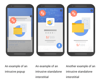
These are called intrusive interstitials by Google. But for most of us, they're just called annoying. And your website's organic rankings in Google's search results will likely suffer if you don't comply with the guidelines.
Here are pop-up styles that Google advises against:
Here is a pop-up format that Google likes for the mobile experience.
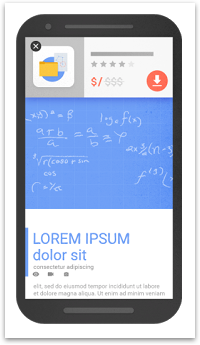
Remember, you can still use the larger pop-ups on a desktop view.
5 Ways to Make Your Website Pop-ups Work Better
1. Time Your Pop-UPS SO THEY'RE HELPFUL, NOT ANNOYING
Before you choose to have any type of pop-up appear on your website, you should first consider whether it's relevant to the visitor. There are some legalities that you probably can't avoid. But take a moment to consider the other pop-ups that you may use. If a visitor has been on your website for 5 seconds, they probably don't know if they want your free content offer download yet.
Try presenting a pop-up based on some rules, such as:
- Only show on pages that indicate they might have interest in a specific type of content offer.
- Show the pop-up after they've either scrolled down the home page, or after being on a page long enough to read some of the content.
- Only show the pop-up a couple of times, not every time you return to the page.
- Definitely don't keep showing the pop-up if they've taken the desired action, ie: they already signed up for your blog emails. This means they don't want to keep getting asked to sign up for the same thing. Using HubSpot's Smart CTAs, you can offer the next logical thing once the first action has been taken.
2. Keep Your Pop-ups Simple
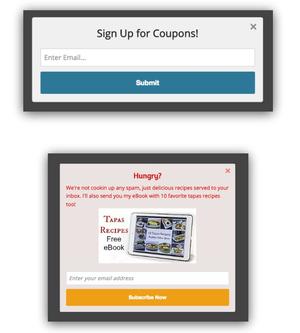
As marketers, our design sense often drives us towards "making things pretty." While this is often important, it's more about offering a pop-up that doesn't take too much time to think about and offers something that's relevant. Check out this example. The first one performed 30% better. It's simple, it offers something you want, and it didn't take more than 2 seconds to read and understand what you were signing up for.
3. Consider using exit intent pop-ups
When a user seems like they're about to leave your website, a pop-up can appear with an offer that will hopefully keep them on your site longer. The longer they're on the site, the more likely they are to convert. For desktop visitors the technology allows for cursor tracking to see if they're about to leave the site. On mobile there are signals such as going back, scrolling up, and switching tabs that can trigger a pop-up.
When using exit intent pop-ups, it's a good idea to keep the total number of pop-up offers to a minimum or none. You also only want to offer the exit intent pop-up if the visitor did not take a conversion action on the website while they were there.
4. Choose pop-up placement carefully
Place the pop-up in the screen that's noticeable, but does not stop the visitor from accessing the content they really want.
- Top banner
- Appear in the bottom right corner
- Center of the screen, but doesn't take over the entire screen without an obvious way to get out of it.

There are services that allow you to create various types of pop-ups. We use HubSpot's Pop Up Forms tool most often because it's easy and built into report with other CTAs and data. It's available in their free version of the product (as of early 2024). It includes a super easy tool that walks you through the steps of creating one.
5. change your pop-ups based on results
It's important to remember that we don't always get things perfect on the first try. If you have a pop-up offer, see how well it's converting to leads. Try a few different ones to see what works best. Maybe try different timings on your chat windows and for the appearance of your offer. If your tool for pop-up management allows for A/B testing, it may be a good idea as long as you have enough traffic to your website to make it a decent sample size.
If you'd like to learn more about how to make pop-ups, live chat and even chat bots work for you to increase leads, let us know and we can set up a time to talk.
Originally posted February 2017. Revised February 2024.


